Purrr 0.1 got released a while ago and I noticed a very nice pattern emerge incombination with dataframes for simulation experiments.
Let's simulate the effect of the law of large numbers. You'll notice that I'm using map_dbl from purrr to keep the syntax clean.
library(dplyr)
library(purrr)
library(reshape2)
library(ggplot2)

df <- data.frame(
  n_100  = 1:2000 %>% map_dbl(~ rnorm(100) %>% mean),
  n_200  = 1:2000 %>% map_dbl(~ rnorm(200) %>% mean),
  n_300  = 1:2000 %>% map_dbl(~ rnorm(300) %>% mean),
  n_1000 = 1:2000 %>% map_dbl(~ rnorm(1000) %>% mean)
)

# checking every column for variance is easy
> df %>% map(var)
       n_100       n_200       n_300       n_1000
1 0.01007404 0.005087112 0.003267154 0.0009894314
It feels like the scala api for spark but for the normal R language. We can confirm that we've properly got a good simulation out of this via ggplot.
ggplot() +
  geom_histogram(data=df %>% melt, aes(value, fill = variable), binwidth = 0.01) +
  facet_grid(variable ~ .) +
  ggtitle("see the distribution change as we increase n")
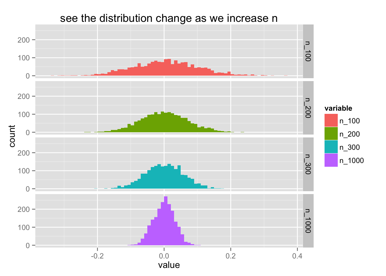
The thing of the law of large numbers is that it does not matter which distribution you use. The mean of the distribution will always converge to a normal distribution. Let's add a layer of abstraction to what we've just done to create many plots of many distributions.
create_df <- function(dist_func, n_means, means){
  data.frame(
    n_100  = 1:n_means %>% map_dbl(~ dist_func(100) %>% mean),
    n_200  = 1:n_means %>% map_dbl(~ dist_func(200) %>% mean),
    n_300  = 1:n_means %>% map_dbl(~ dist_func(300) %>% mean),
    n_1000 = 1:n_means %>% map_dbl(~ dist_func(1000) %>% mean)
  )
}

plot_df <- function(df, distname){
  ggplot() +
    geom_histogram(data=df %>% melt, aes(value, fill = variable), binwidth = 0.01) +
    facet_grid(variable ~ ., scales = "free_y") +
    ggtitle(paste('distribution of means from', distname, 'distribution'))
}

list(gauss = rnorm, uniform = runif) %>%
  map(~ create_df(., 200)) %>%
  map2(names(.), ~plot_df(.x, .y))
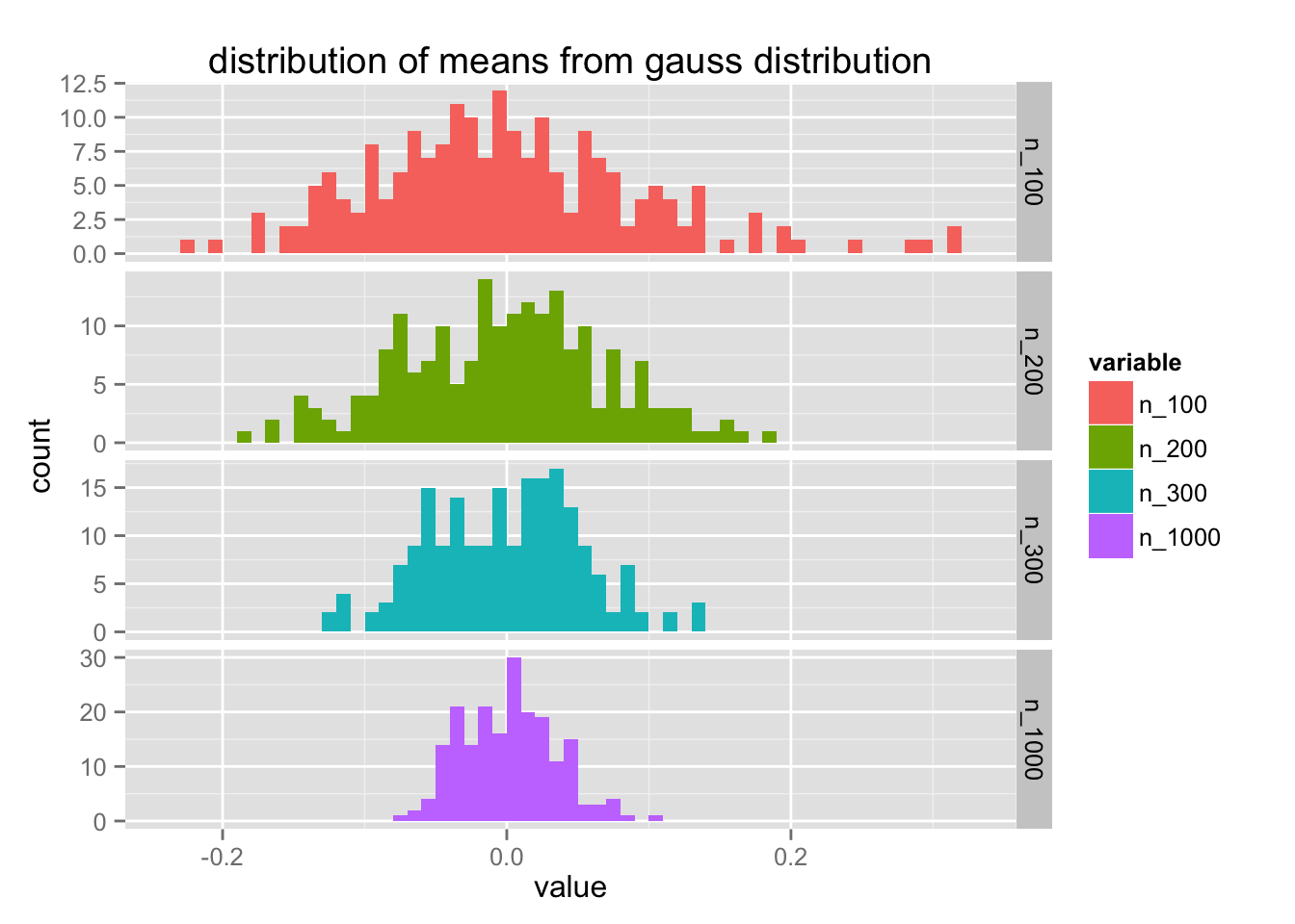
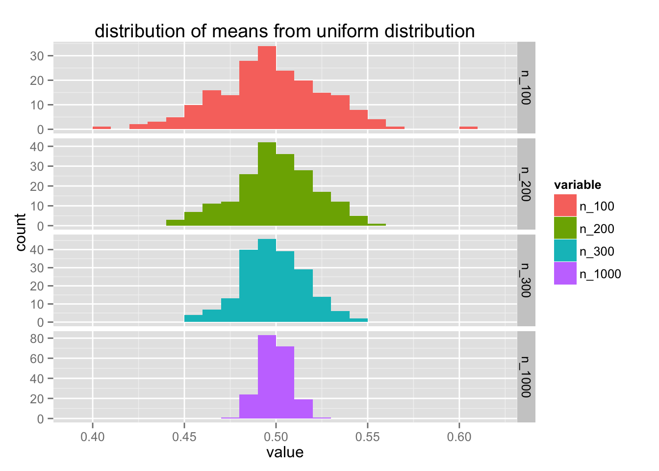
Notice that the y-axis differs for each value of $n$. Let's try to improve this code a bit more. It feels like create_df can have a bit more flexibility.
create_df <- function(dist_func, name, n_means, sample_means){
res <- sample_means %>%
map(~ 1:n_means %>% map_dbl(~ dist_func(.) %>% mean))
names(res) <- sample_means %>%
map_chr(~ paste0('n_', as.character(.)))
res %>%
data.frame %>%
mutate(name = name)
}
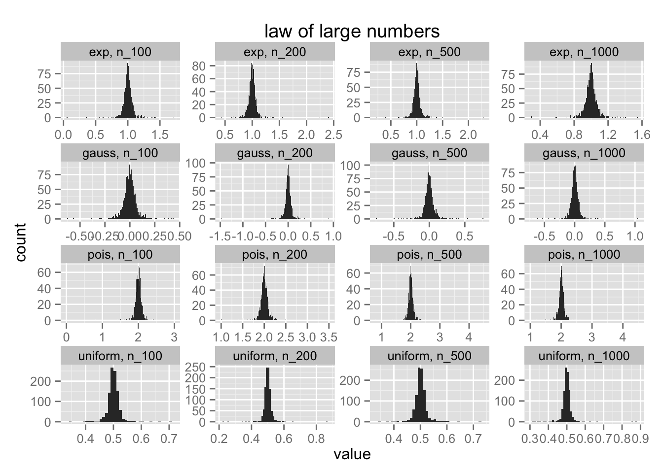
plot_all <- function(df){
pltr <- df %>% melt
ggplot() +
geom_histogram(data=pltr %>% arrange(name, variable),
aes(value), binwidth = 0.01) +
facet_wrap(~ name + variable, scales = "free") +
ggtitle('law of large numbers')
}
distributions <- list(
gauss = rnorm,
uniform = runif,
pois = function(x) rpois(x, 2),
exp = rexp
)
distributions %>%
map2(names(.), ~ create_df(.x, .y, 1000, c(100, 200, 500, 1000))) %>%
reduce(rbind) %>%
plot_all
Functions are very powerful and purrr is a nice addition to R because of it. It allows you to combine functional operations both outside and within dataframes. The combination is very powerful. Just look at how simple it is to create bootstrap samples and with regression samples;
1:2000 %>%
  map(~ ChickWeight %>% sample_n(50)) %>%
  map_dbl(~ lm(weight ~ Time, data = .) %>% coefficients %>% .[2]) %>%
  hist(50)
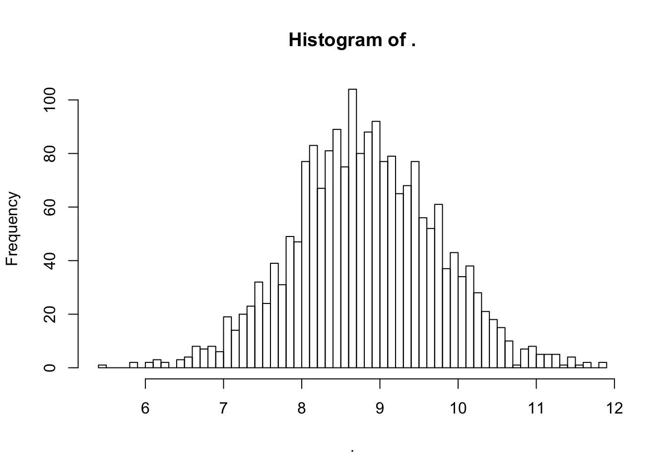
Notice that although I am sampling means from four different distributions; the distribution of means is always normal. Simulating this with purrr removes the need for many for loops, keeping things clean. I can see this package going places. It really cleans up much of my code.