Sometimes you'll to confirm if a timeseries pattern is influenced by the day of the week. Weekends are a prime example for when usually online behavior is different. This document will explain a method of communicating this visually.
library(ggplot2)
library(dplyr)
Let's first generate some data which has a small negative bias towards the weekend.
n <- 750
df <- data.frame(datetime = as.POSIXct('2015-01-01') + (1:n)*3600,
                 value = rnorm(n))

df <- df %>%
  mutate(day_of_week = datetime %>% strftime('%A'),
         week_nr = datetime %>% strftime('%W')) %>%
  mutate(value = ifelse(day_of_week %in% c('Saturday', 'Sunday'),
         value - runif(n) * 3, value))

ggplot() +
  geom_line(data=df, aes(datetime, value)) +
  ggtitle('timeseries without weekends highlighted')
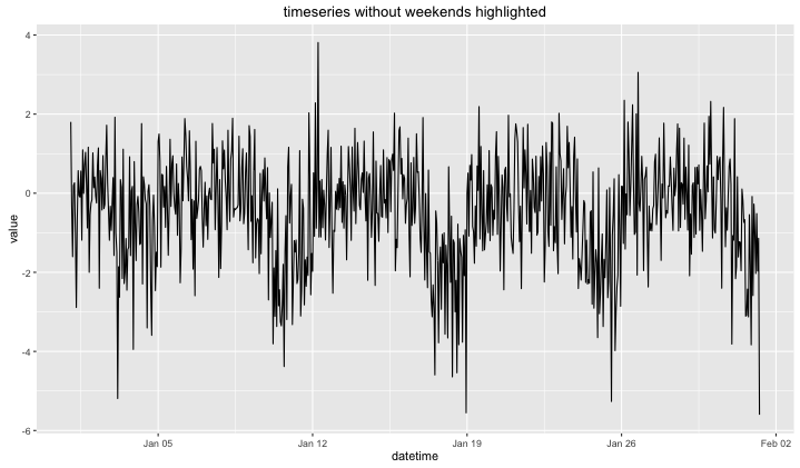
The bias is big enough to suggest some form of seasonality, though it may not immediately be obvious that it is for weekends. We could look up the dates and confirm that the time between the peaks are 7 days, but perferably this we want to commincate this visually.
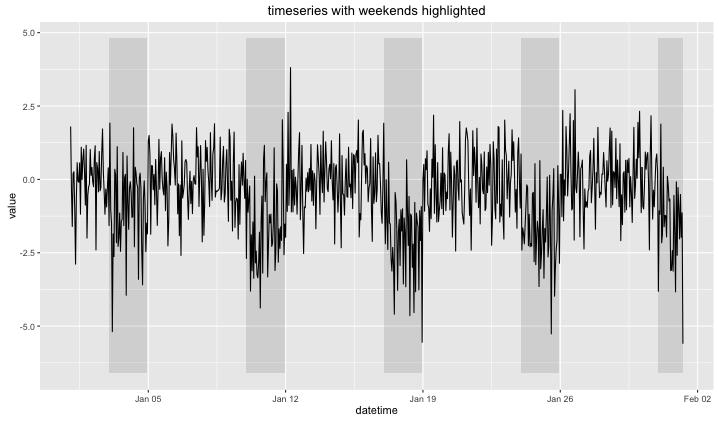
Let's instead create a dataframe that will be able to highlight correct dates.
y_min = (df$value %>% min) - 1
y_max = (df$value %>% max) + 1

df_highlight <- df %>%
  filter(day_of_week %in% c('Saturday', 'Sunday')) %>%
  group_by(week_nr) %>%
  summarise(xmin = min(datetime), xmax = max(datetime))

ggplot() +
  geom_rect(data=df_highlight,
            aes(xmin = xmin, xmax = xmax, ymin = y_min, ymax = y_max),
            alpha = 0.15) +
  geom_line(data=df, aes(datetime, value)) +
  ggtitle('timeseries with weekends highlighted')
Hours per day
Another pattern to consider is to look at certain hours during the day. The code will be similar. We'll seperate the concern of highlighting the correct dates to another dataframe and another layer of the plot.
set.seed(1)
n <- 150
df <- data.frame(datetime = as.POSIXct('2015-01-01') + (1:n)*3600,
                 value = rnorm(n))

df <- df %>%
  mutate(hour = datetime %>% strftime('%H') %>% as.numeric,
         date = datetime %>% as.Date,
         value = ifelse(hour %in% 1:6, value - 1 - runif(n), value))

ggplot() +
  geom_line(data=df, aes(datetime, value)) +
  ggtitle('timeseries without early hours highlighted')
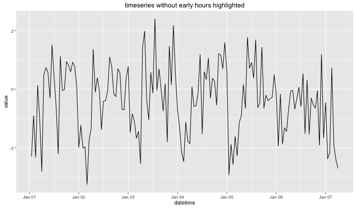
Note that from this series, it is visually not obvious that there is a pattern.
y_min = (df$value %>% min) - 0.1
y_max = (df$value %>% max) + 0.1

df_highlight <- df %>%
  filter(hour %in% c(1,2,3,4,5,6)) %>%
  group_by(date) %>%
  summarise(xmin = min(datetime), xmax = max(datetime))

ggplot() +
  geom_rect(data=df_highlight,
            aes(xmin = xmin, xmax = xmax, ymin = y_min, ymax = y_max),
            alpha = 0.15) +
  geom_line(data=df, aes(datetime, value)) +
  ggtitle('timeseries with early hours highlighted')
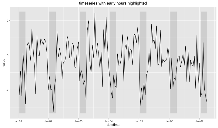
The pattern does become obvious when you apply the highlight.
Conclusion
This 'obviousness' should prompt a potential danger; visual bias. Even though this highlighting technique might be effective to point out a pattern when there is one it may also suggest a pattern when there isn't. It remains a useful technique simply because from a domain perspective it is very sensible to visually confirm the effect of certain periods.
You should also be able to find this blog on: r-bloggers