When exploring a new dataset you want to be able to visualise the dataset for patterns (usually with something like ggplot2). This usually starts by selecting two variables that seem reasonable to plot against eachother and then iterating over possible visualisations until you find a pattern.
Unfortunately, this is a very time consuming process. Instead of doing all this work manually, why not just plot all variables against eachother to get a glimpse of the data?
Enter GGally
 Let's do a quick hello world.
library(GGally)
library(dplyr)
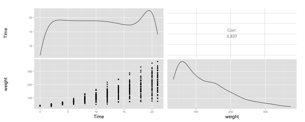
ChickWeight %>%
select(Time, weight) %>%
ggpairs
The ggpairs function takes a dataframe (in this case we first reduce the dataframe to only have two columns) and makes plots between all variables. On the diagonal it lists a histogram each variable.
Discrete Values
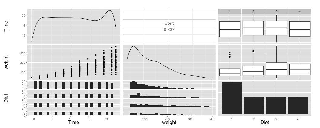
Note that all plotted variables were continous variables, if we add a discrete variable it will automatically detect and adjust it's plotting.
ChickWeight %>%
  select(Time, weight, Diet) %>%
  ggpairs
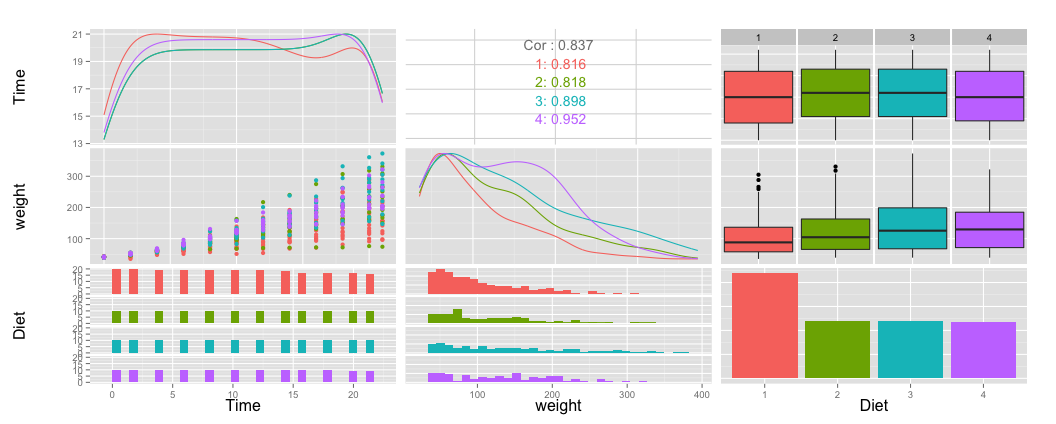
If this variable is of special interest, we can assign a color to it across all subplots.
ChickWeight %>%
  select(Time, weight, Diet) %>%
  ggpairs(colour = "Diet")
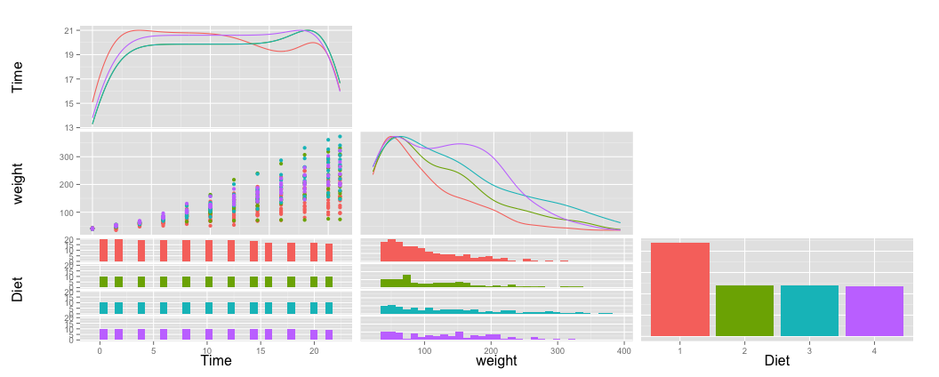
You might notice that we are plotting a lot of charts and that this might take a lot of time. If we want to prevent this we can choose to only plot the lower triangle half.
ChickWeight %>%
  select(Time, weight, Diet) %>%
  ggpairs(colour = "Diet",
          upper="blank")
Extra settings
There are three different situations for ggally when it is considering making a subplot between two variables:
- continous variable x continous variable
- continous variable x discrete variable
- discrete variable x discrete variable
If we now take a different dataset with all these different crossplots we will see what the function will do for each of these situations.
mtcars %>%
  mutate(cyl = as.factor(cyl), am = as.factor(am)) %>%
  select(hp, wt, cyl, am) %>%
  ggpairs(title = "a matrix of characteristics")
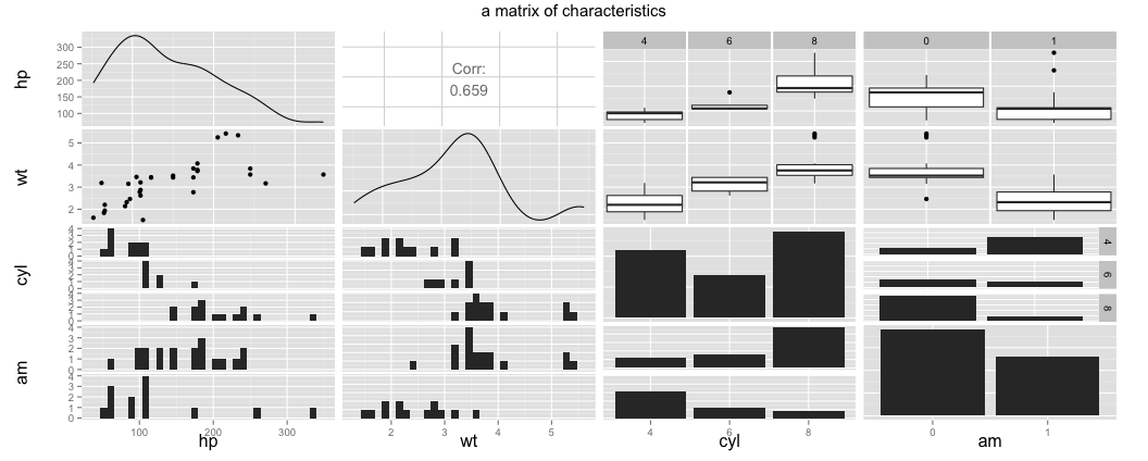
Notice that I've purposefully casted the cyl and am variables for this purpose.
The upper and lower settings can adapt for different combinations of values. The following settings are available according to the documentation:
- continuous : "points", "smooth", "density", "cor", "blank"
- combo : "box", "dot", "facethist", "facetdensity", "denstrip", "blank"
- discrete: "facetbar", "ratio", "blank"
mtcars %>%
  mutate(cyl = as.factor(cyl)) %>%
  select(mpg, disp, hp, wt, cyl) %>%
  ggpairs(title = "a matrix of characteristics",
          upper = list(continuous = "density", combo = "box"),
          lower = list(continuous = "smooth"),
          color = "cyl")
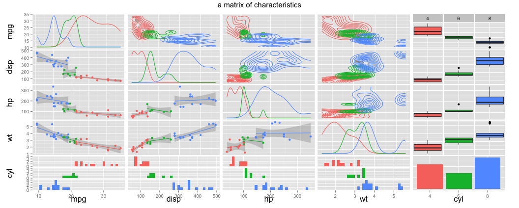
That's a lot of exploratory plotting for just one command.
Conclusion
All in all ggally feels like a huge timesaver, albeit a bit slow. You can always prevent the long plotting time by either reducing the number of plots you are drawing or by selecting only a sample of your data (via sample_n for example).
You should also be able to find this blog on: r-bloggers