In this document I’ll explain some nice characteristics of radial basis functions.
Introduction
A radial basis function is a real-valued function whose value depends only on the distance from the origin. For example;
$$ \phi_i(x) = exp\left(-\frac{1}{2\alpha}(x-m_i)^2\right)$$x = seq(-2,5,0.01)
y = exp(-1/0.5*(x)^2)
rbf_df <- data.frame(x=x, y=y, m='0')
for(i in 1:4){
rbf_df <- rbind(rbf_df, data.frame(x=x, y=exp(-1/0.5*(x-i)^2), m=as.character(i)))
}
ggplot() +
geom_line(data=rbf_df, aes(x,y, colour=m)) +
ggtitle('different RBFs for different "m"')
Use case in pattern learning
These functions have interesting uses in pattern learning, especially in situations where there is a repeating pattern. The ideal will be to take a continous area and to place evenly spaced radial basis functions.
To keep things simple, I’ll assume that \(\alpha = 1\), which reduces the expression to;
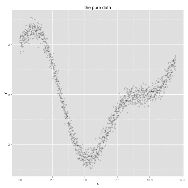
$$ \phi_i(x) = exp\left(\frac{1}{2}(x-m_i)^2\right)$$I’ll now generate some data and use this function to generate features from it. Let’s assume that I am generating data that is happening in a year over a period of 12 months.
x <- c(seq(0, 12, 0.01))
y <- sin(x) + 2*cos(x/2) + rnorm(length(x), 0 , 0.2)
df <- data.frame(x = x, y = y)

ggplot() +
  geom_point(data=df, aes(x, y), alpha=0.4) +
  ggtitle('created data')
This data might be sales for a certain product that does better in colder periods of the year as opposed to warmer periods of the year.
Now I will generate features for this dataset. First, I’ll add dummy variables, one for each month and then I’ll add radial basis functions with means around the same month.
df$z = floor(x) %>% as.factor

for(m in 1:12){
  df[[paste0('x', m)]] <- exp(-1/2*(x-m)^2)
}
I will now create two models;
- one will use dummy variables for each month (1-12) and instead those into a linear model
- the other will use 12 radial basis functions, each simulating a month
df$pred_floor <- lm(y ~ ., data=df %>% select(y, z)) %>% predict(df)
df$pred_rad <- lm(y ~ 0 + ., data=df %>% select(-x, -z, -pred_floor)) %>% predict(df)
ggplot() +
  geom_point(data=df, aes(x, y), alpha = 0.4) +
  geom_line(data=df, aes(x, pred_floor), color='red', size = 1) +
  geom_line(data=df, aes(x, pred_rad), color='steelblue', size = 1) +
  ggtitle('dummy variables (red) vs. RBFs (blue)')
We can already see that the basis radial function can help us smoothe out any seasonality effects. Still, when we look at the model summary we get the impression that not all model inputs are significant.
Residuals:
     Min       1Q   Median       3Q      Max
-0.68951 -0.14282  0.00027  0.14625  0.61059

Coefficients:
    Estimate Std. Error t value Pr(>|t|)
x1   2.78156    0.05104  54.500  < 2e-16 ***
x2  -0.37352    0.10721  -3.484 0.000512 ***
x3   1.40336    0.15269   9.191  < 2e-16 ***
x4  -1.84918    0.18472 -10.011  < 2e-16 ***
x5  -0.60581    0.20559  -2.947 0.003275 **
x6  -1.58640    0.21831  -7.267 6.66e-13 ***
x7  -0.15144    0.22515  -0.673 0.501316
x8   0.11158    0.22721   0.491 0.623450
x9  -0.22219    0.22410  -0.991 0.321660
x10  0.42819    0.21271   2.013 0.044332 *
x11 -0.87599    0.18411  -4.758 2.19e-06 ***
x12  1.73673    0.11847  14.659  < 2e-16 ***
There are other ways of determining if we should include a rbf in our model but this method is straightforward enough. Let’s evaluate a less verbose collection of radial basis functions in the model.
df$pred_rad2 <- as.formula(y ~ 0 + x1 + x2 + x3 + x4 + x6 + x10 + x12) %>%
  lm(data=df) %>%
  predict(df)
The summary of this model now becomes;
Residuals:
    Min      1Q  Median      3Q     Max
-0.6550 -0.1467  0.0002  0.1578  0.5829

Coefficients:
    Estimate Std. Error t value Pr(>|t|)
x1   2.90746    0.04375  66.452  < 2e-16 ***
x2  -0.70988    0.07574  -9.373  < 2e-16 ***
x3   1.95191    0.07607  25.660  < 2e-16 ***
x4  -2.51603    0.04508 -55.812  < 2e-16 ***
x6  -1.95603    0.01969 -99.339  < 2e-16 ***
x10 -0.15426    0.01878  -8.213 5.57e-16 ***
x12  1.05308    0.02645  39.809  < 2e-16 ***
---
Signif. codes:  0 ‘***’ 0.001 ‘**’ 0.01 ‘*’ 0.05 ‘.’ 0.1 ‘ ’ 1
The plot looks very similar.
ggplot() +
  geom_point(data=df, aes(x, y), alpha = 0.5) +
  geom_line(data=df, aes(x, pred_floor), color='red', size = 1) +
  geom_line(data=df, aes(x, pred_rad2), color='steelblue', size = 1.5)
Notice that the smoothed model still outperforms the dummy model and that I am using less dimensions of data while still maintaining a significant model.
How it works
This may feel like voodoo to some. To give more of a visual feel for how this ‘trick’ works, I’ve plotted the resulting radial basis functions below.
mod_data <- as.formula(y ~ 0 + x1 + x2 + x3 + x4 + x6 + x10 + x12) %>%
  lm(data=df) %>%
  tidy

rbf_effect <- function(n){
  factor <- mod_data %>% filter(term == n) %>% select(estimate) %>% as.numeric
  df[[n]] * factor
}

vars <- c('x1','x2','x3','x4','x6','x10','x12')
pltr <- df

for(v in vars){
  pltr[[v]] <- rbf_effect(v)
}

pltr <- pltr %>%
  select(x, x1, x2, x3, x4, x6, x10, x12) %>%
  melt(id.vars = c('x'))

ggplot() +
  geom_point(data=df, aes(x, y), alpha = 0.3) +
  geom_line(data=pltr, aes(x, value, colour = variable), size =1.5) +
  ggtitle('different RBFs with applied weights plotted with simulated data')
By using the animate package I’ve been able to create a gif that shows how the smoothed line is constructed.
Conclusion
We’ve used a simple linear model here to keep the code from getting verbose but you can apply this feature generating technique in combination with many other approaches. This method especially seems to be a preferable method to model seasonality. Dummy variables tend to cause ugly jumps in the data and the only way to combat this is to up the dimensionality, which has onwanted side effects.