Suppose you want to summerize a text document visually. You cannot summerize a text with a simple chart so instead you might be tempted to make a word cloud.
I am going to argue that word clouds might be a bad idea. To explain my thoughts I'll be using a dataset from the appsterdam meetup page. This is a document of text in which Amsterdam based developers describe themselves and their skill set. This list has been acquired through the meetup API.
After filtering some of the data, this is what wordle will make out of it:
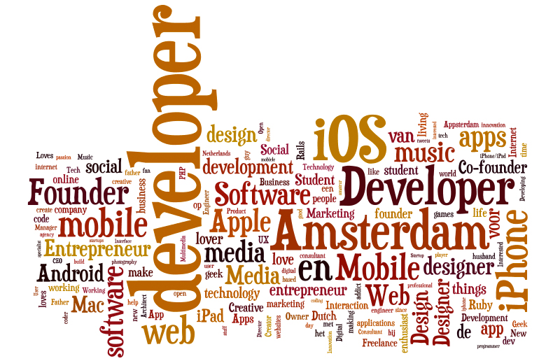
Wordle takes all the words, removes stopwords and checks which words occur the most often. It displays larger words larger and smaller words larger in an attempt to summerize the text. Notice a few things here:
- The size of the word does not automatically tell you if a word occurs often because a long word will automatically be bigger than a small word (compare 'ios' and 'developer', which font is bigger?).
- The colors have no meaning.
- The locations of words have no meaning.
- We use a lot of space to display only a little bit of information.
I think we can come up with something better. Let's compare this visualisation with this one:
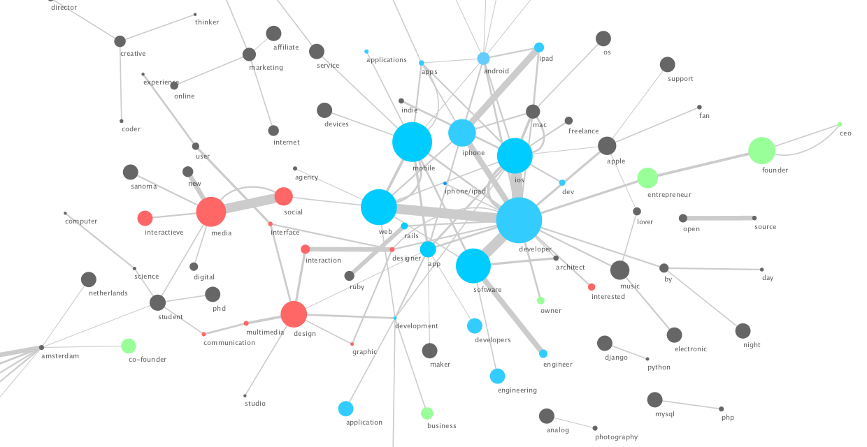
I am now summerizing the text by visualizing the graph of bigrams instead of the word count. Notice how:
- The size of the node in the graph represents how often a word is used without the word's length causing bias.
- The colors of the nodes can be used to give meaning to the word, here I used it to classify words.
- The connections between words have meaning. Thick lines indicate two words being used often together while thin lines or no lines at all suggest that the two words are less related.
- By having our data take this shape we can see a whole new story. Certain words form clusters together. Blue dots resemble words that indicate that a person is a developer, we can see the green dots indicate that the person is from the business side of the development industry and red dots indicate that a person might be a designer.
Word clouds can be very pretty, but the graph based view is capable of showing more information.